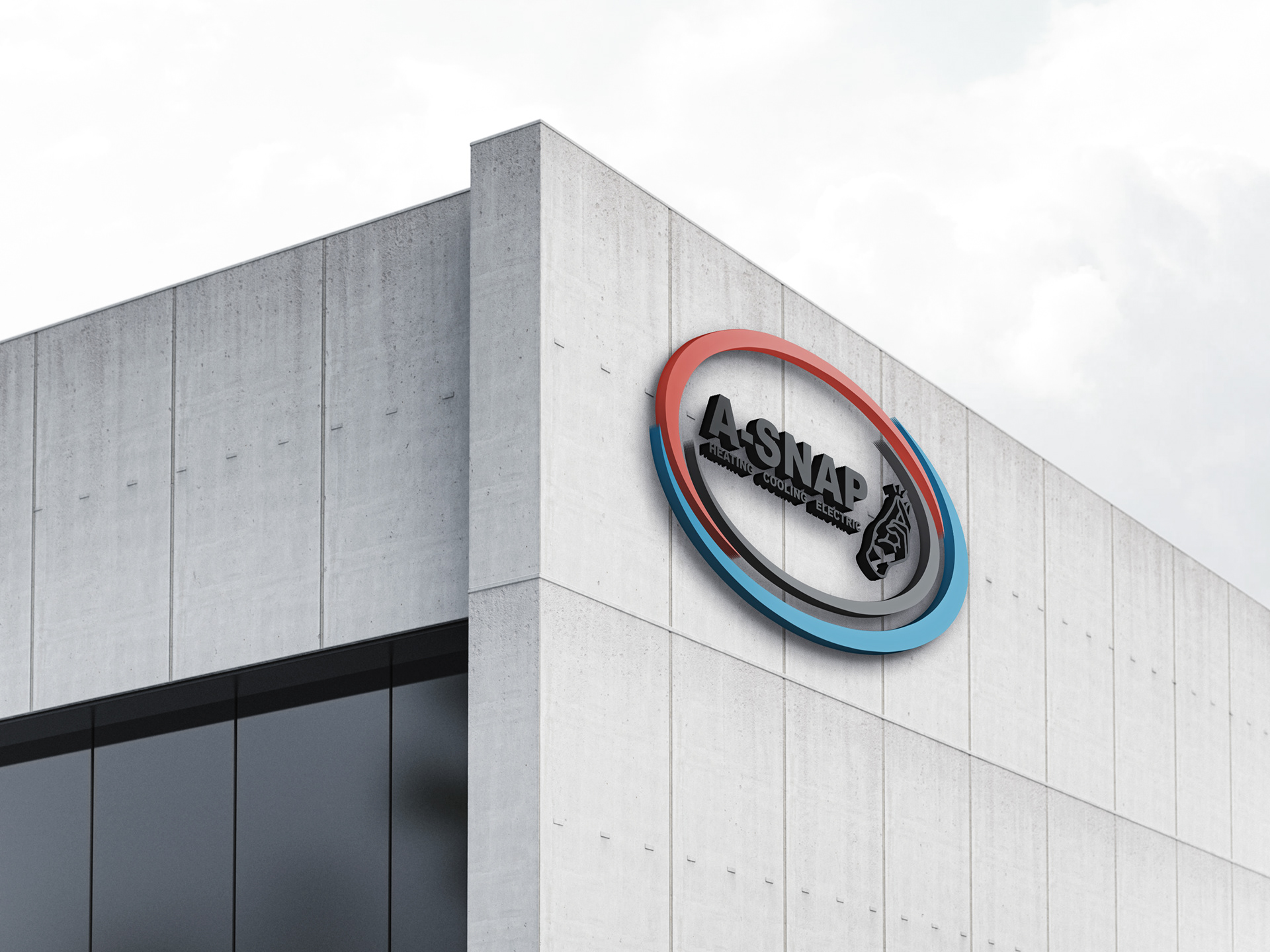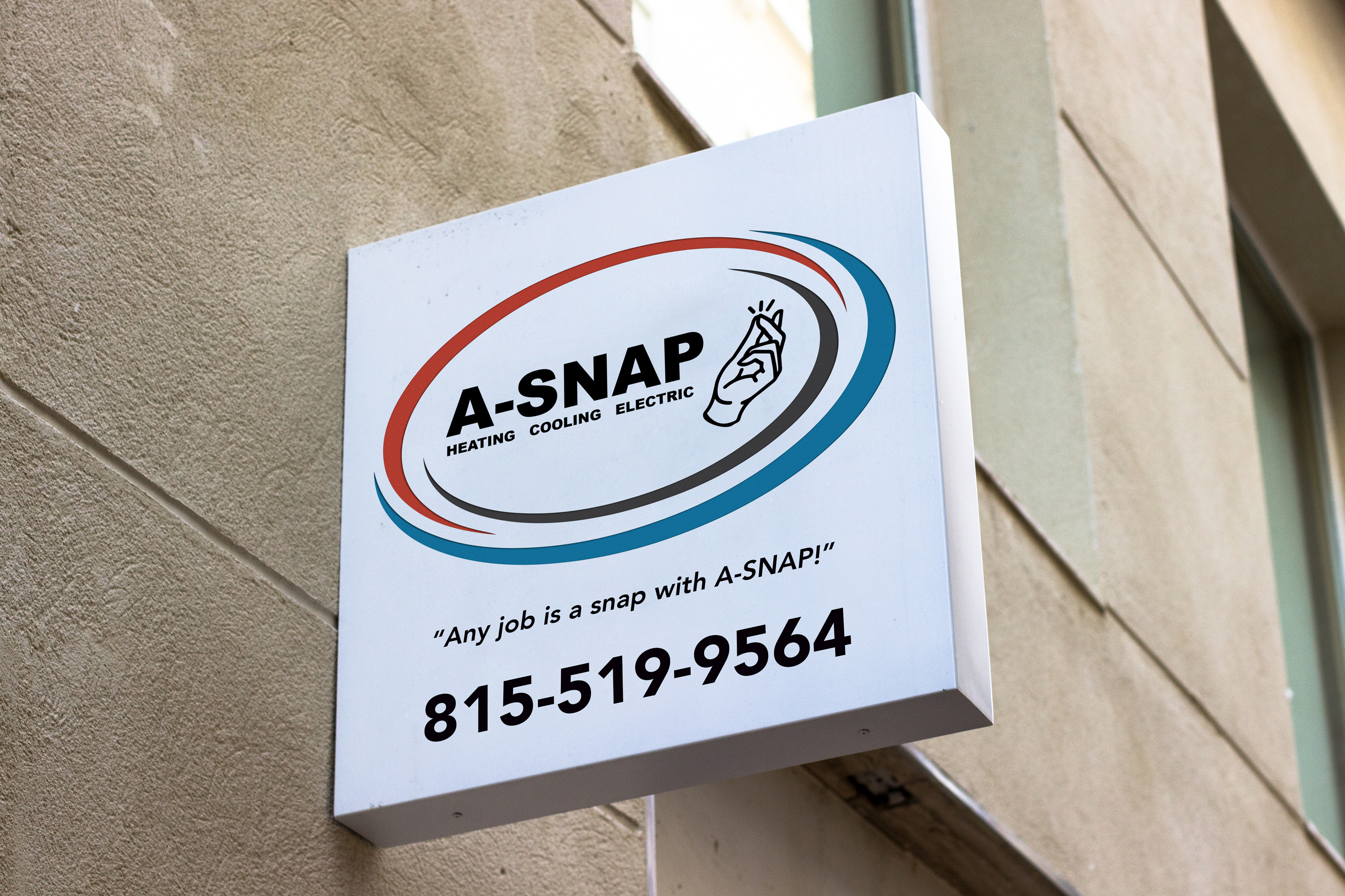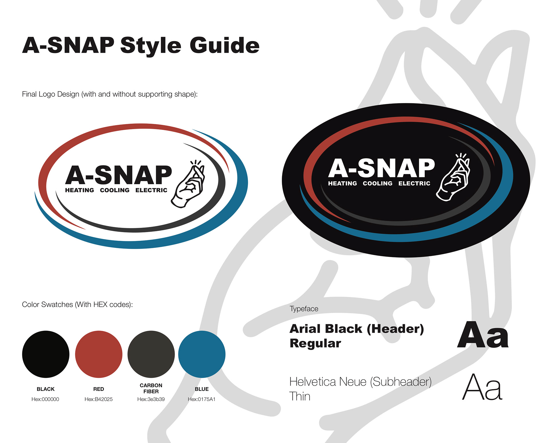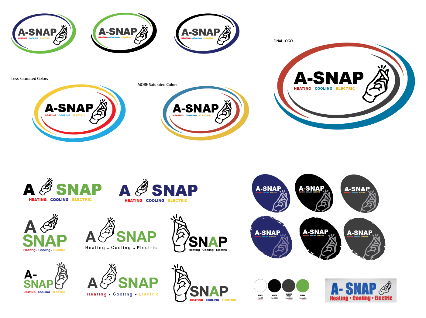
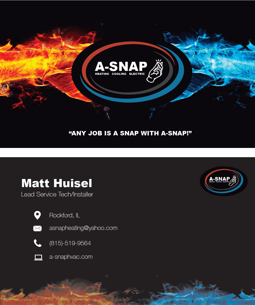
Their original logo needed a refresh (botton right). So, we explored many options that would help them stand out from competitors. They wanted to keep their snapping hand icon, as it was the staple image of their branding.

The Final Logo has all black lettering as well as their phone number for contacting.
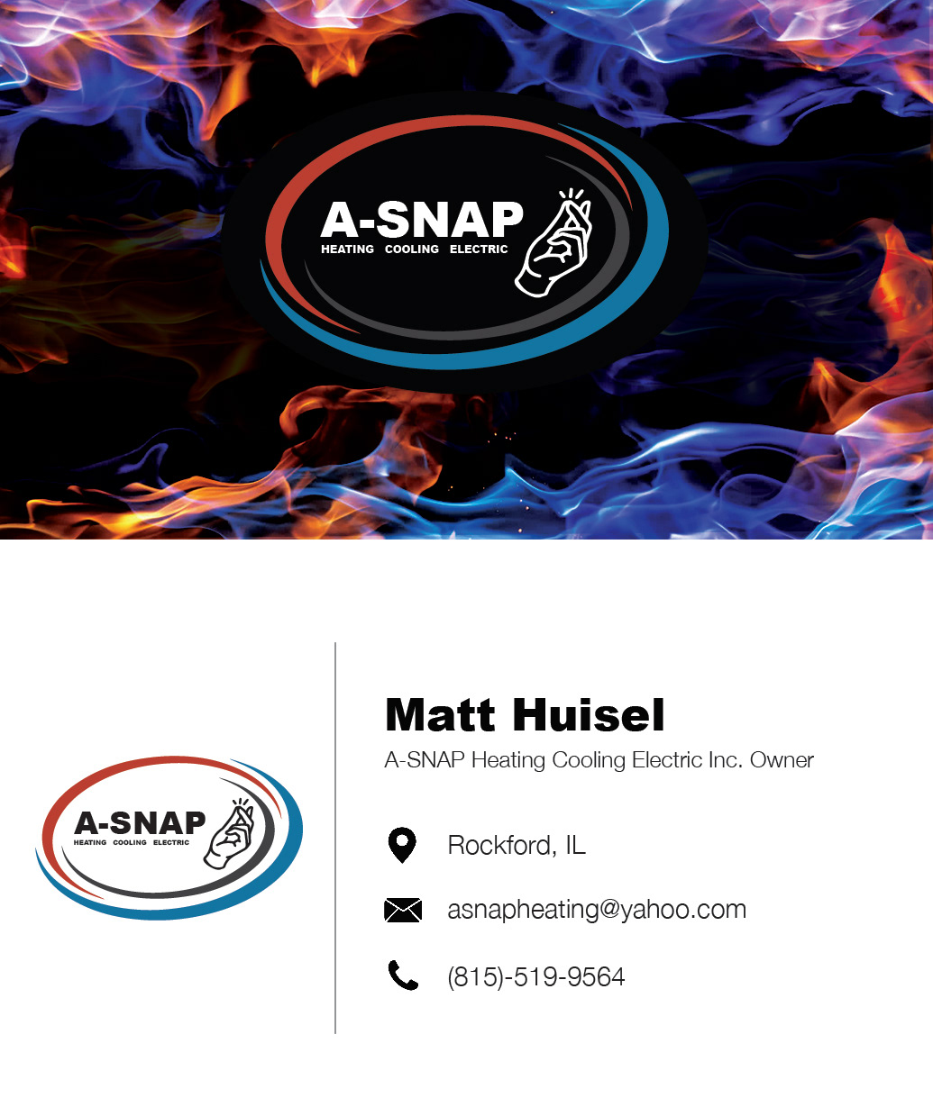
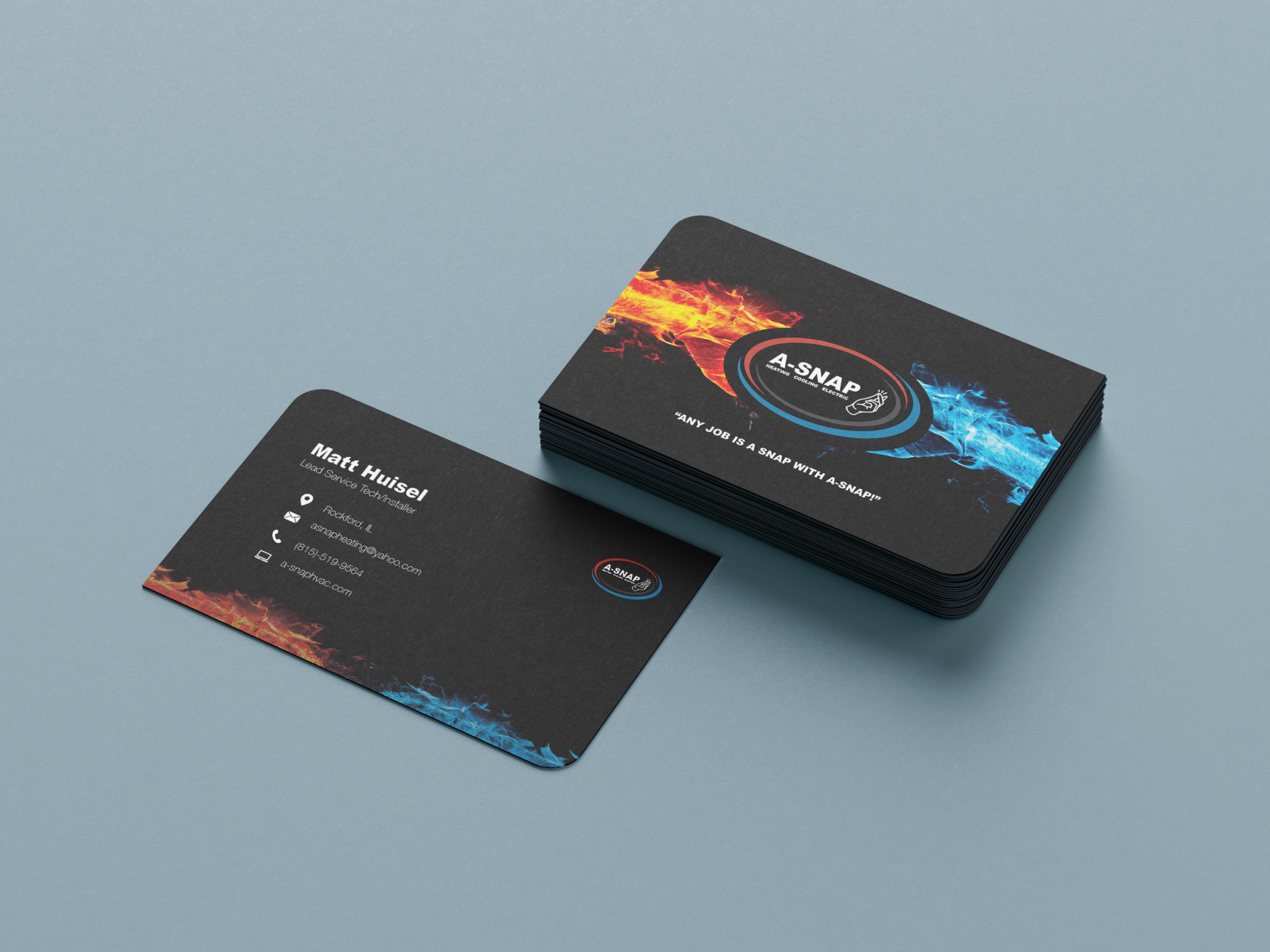
Final Approved Business card Design